Hello! My name is June Kim. I'm a journalist who writes, analyzes data, and produces compelling graphics from start to finish.

With a background in computer science and journalism, I merge rigorous data-driven reporting with eye-catching visuals.

I am currently a Graphics Fellow at The New York Times, where I report on visual and data-driven stories. Prior to this, I covered climate and energy for MIT Technology Review and reported for outlets including Scientific American, Inside Climate News, Twin Cities PBS and more. I hold a master's degree in Data Journalism from Columbia Journalism School.

Data & Graphics Reporting

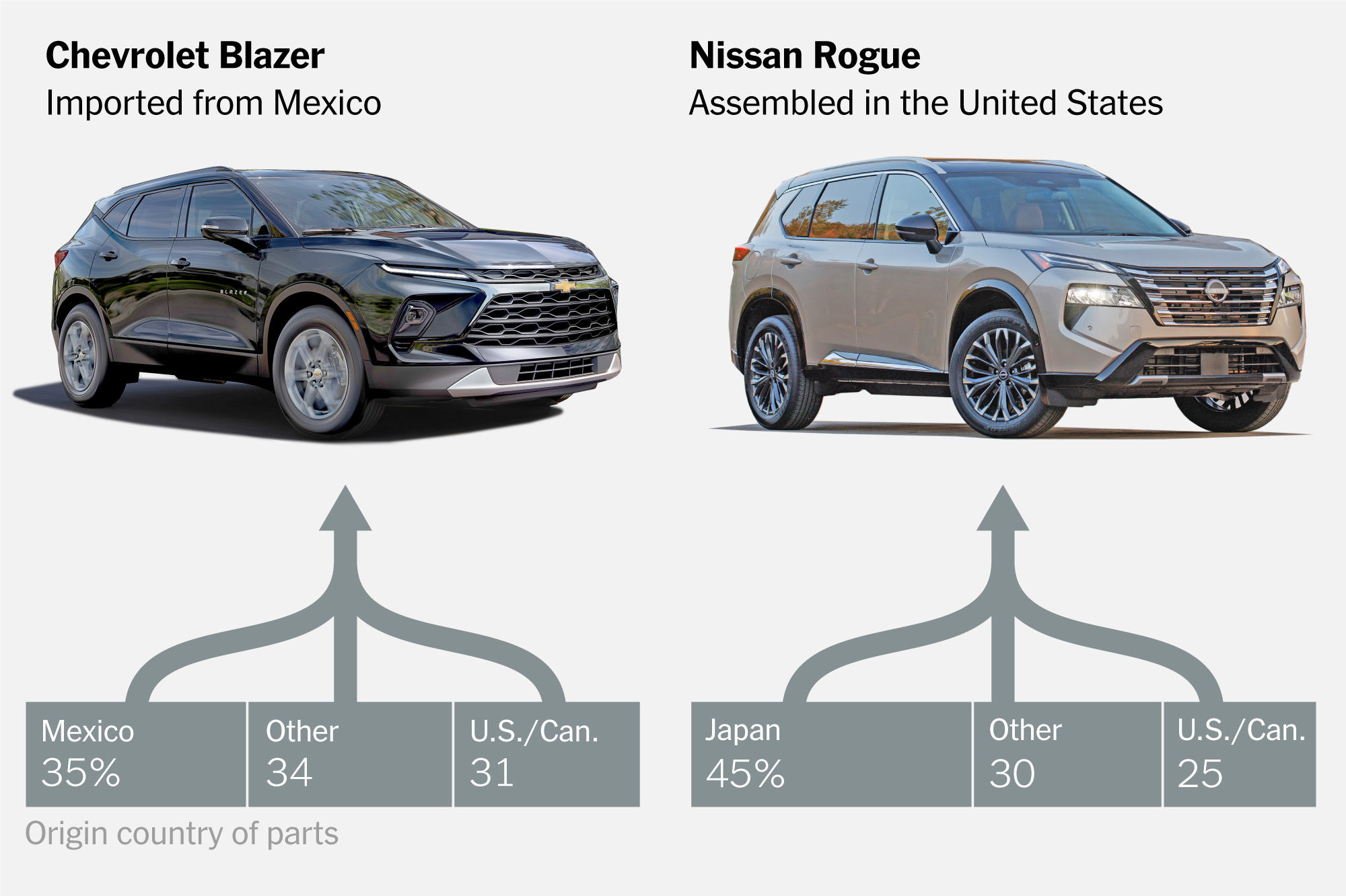
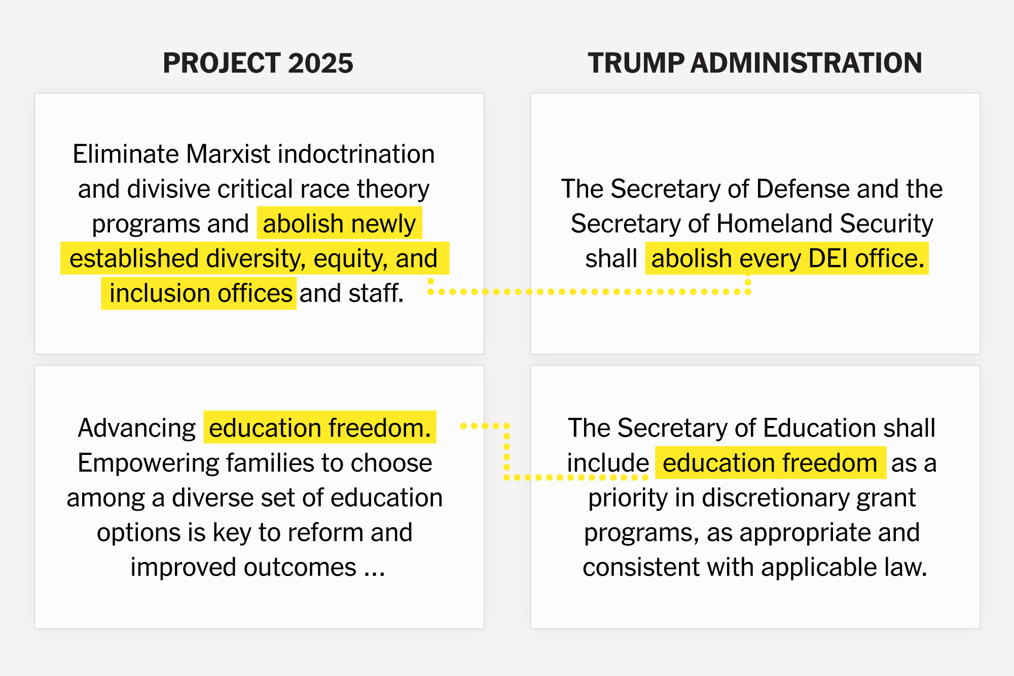
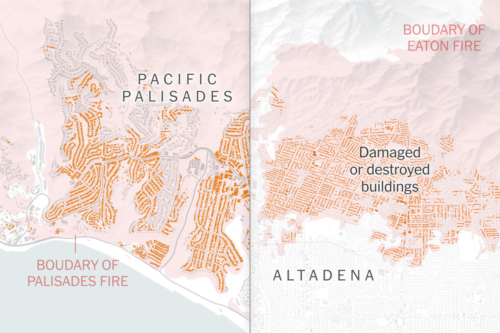
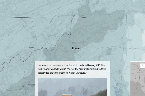
Take a look at some of my best work. All stories include original reporting, data gathering and analysis using python or R. I use ggplot and Rawgraphs for exploratory visualizations, before polishing the charts using Illustrator. I also love creating beautiful maps using satellite imagery and QGIS!

The New York Times

The DOGE Playbook Targeting Federal Agencies

I designed and produced a motion graphic-driven article that illustrates how DOGE systematically targets Federal agencies.

After Effects Illustrator

The New York Times

The Problem With Car Tariffs: What’s an Import?

The story explains how the auto supply chains extend across U.S. borders with Mexico and Canada, making it hard to say what’s American-made.

Pandas Illustrator

The New York Times

How Tariffs Work

In this widely read explainer, I follow the supply chain of a pair of sneakers to explain how exactly tariffs work and who pays for them.

After Effects Pandas Illustrator Svelte

The New York Times

How Trump’s Directives Echo Project 2025

The story compares President Trump's orders with Project 2025 documents to see how his policies could be informed by the ideas of Project 2025.

Svelte

The New York Times

Mapping the Damage in Altadena and Pacific Palisades

An early look at the buildings damaged by the fires in Los Angeles, through maps, photos, and videos.

Illustrator

The New York Times

Hurricane Helene: Mapping More Than 600 Miles of Devastation

The story takes readers through hundreds of miles of destruction caused by Hurricane Helene, using interactive map with photos.

The New York Times

This Election Is Also a Choice Between Two Visions of the Federal Courts

I analyzed and visualized the Federal judicial appointments by Trump and Biden that showed the stark differences in how they shaped the federal judiciary.

Pandas Illustrator R statistics Web scraping

The New York Times

Once Top Advisers to Trump, They Now Call Him ‘Liar,’ ‘Fascist’ and ‘Unfit’

The story compiles and visualizes the statements of former Trump advisers who have since spoke out against him.

Svelte

The New York Times

What time do the polls close?

I created an interactive map that shows the Presidential election poll closing times for each state in the US.

Svelte

MIT Technology Review

Four ways AI is making the power grid faster and more resilient

This trend piece explores different ways AI technologies are transforming the ways we manage the power grid.

Scientific American

Increasing Power Outages Don’t Hit Everyone Equally

I reported on the health impact of power outages and how many socially vulnerable communities are hit harder.

QGIS Illustrator

Columbia News Service

Heat Pumps Are The Hottest Thing in Sustainable Energy, But New York Lags Behind The Trend

I analyzed heating data from the EIA, and used hand-drawn illustrations to explain why New York has been slow in heat pump expansion.

Pandas R statistics Illustrator

Scientific American

Can We Save Every Species from Extinction?

I created data visualization for the magazine's feature story using the dataset from Endangered Species Act.

Pandas Illustrator

Columbia Journalsim School

Two Decades of South Korea's Energy Permitting, in One Chart

I scraped and analyzed 20 years of energy permitting records from PDF files, categorizing them by energy sources. I compared permitting records with actual generation data, revealing a significant backlog in wind power development.

Pandas Mapbox

Columbia Journalsim School

Seoul's Forested Oases Are Disappearing. Rampant Housing Development Is To Blame.

I used satellite imagery and historical forest data to reveal that Seoul lost over 5,500 hectares of forests in the past six decades.

Pandas Illustrator ai2html

Videos & Multimedia

Before diving into data journalism, I spent several years as a multimedia producer and video editor. I feel at home when I'm using Premiere Pro, After Effects, and Illustrator to create captivating visual stories. All videos are written, produced, filmed, edited, and animated by me.

Why We Should Pay Attention to What's on Indian Rooftops

Gujarat sets an example for rooftop solar PV expansion.

Premiere Pro After Effects

Why Swapping Coal with Gas Cannot Save Us

New study reveals South Korea's gas plants may cause 23,000 premature deaths by 2064.

Premiere Pro After Effects Videography

Korea's Toxic Air Pollution, Explained

How did Korea’s air quality become so poor?

Premiere Pro After Effects Videography

How South Korea’s public financiers are fueling the climate crisis

A new report exposes South Korean public banks' involvement with risky fossil fuels.

Premiere Pro After Effects

Making Woven Art without Tools

Somali elders teach traditional finger weaving for the public.

Premiere Pro Videography

Korea's Green New Deal, Explained

The video explainer explores the content and limitations of the Korean Green New Deal.

Premiere Pro After Effects Illustrator

© 2023 — June Kim